Exhibits
What Makes A Museum?
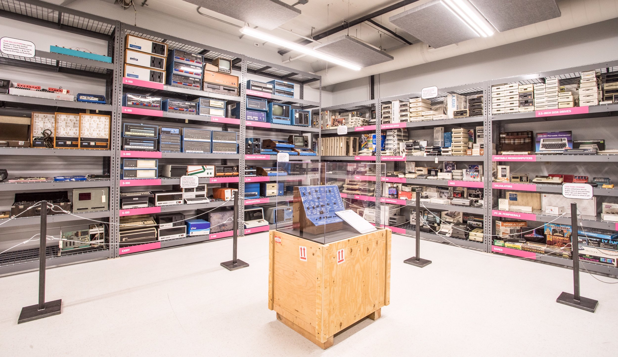
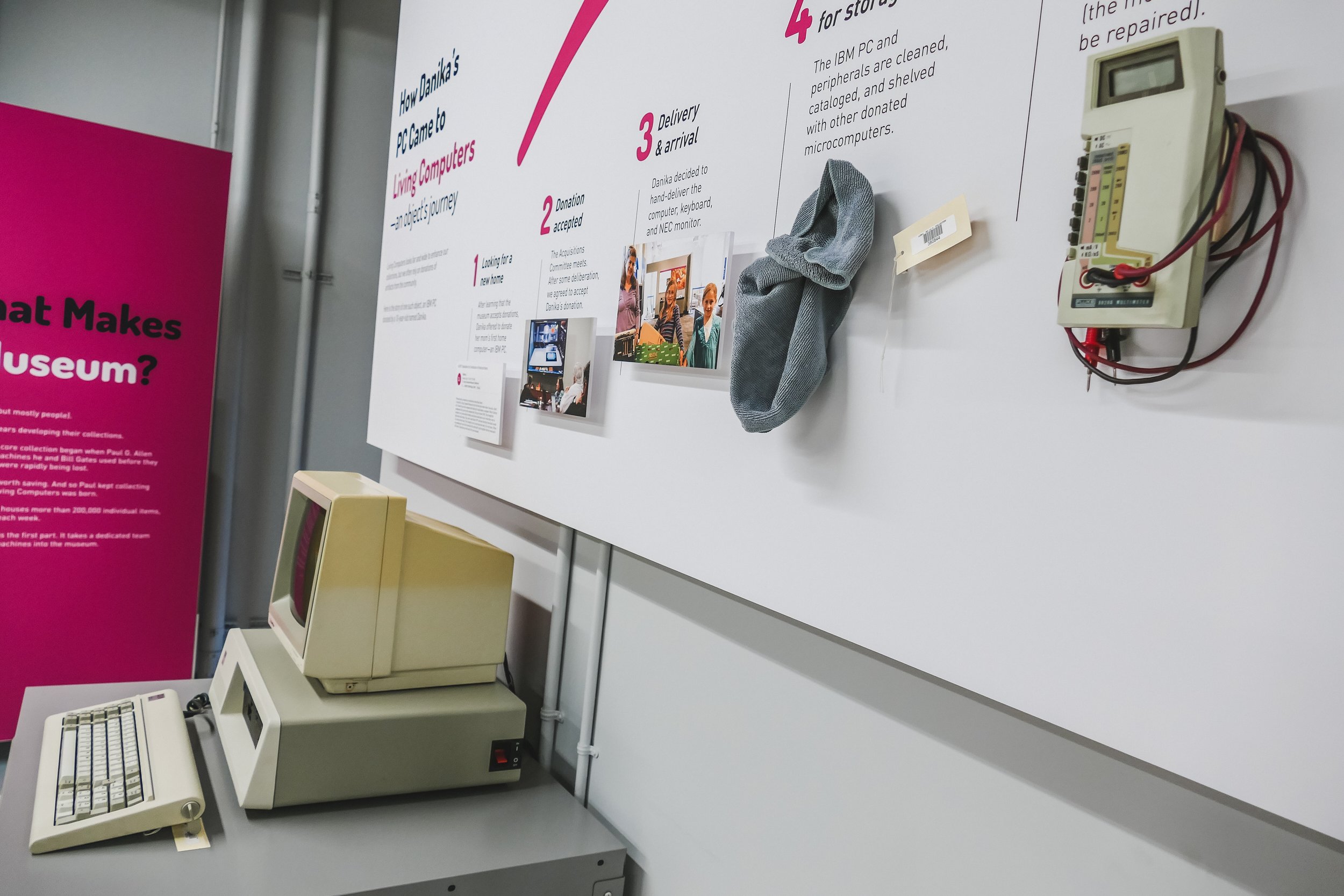
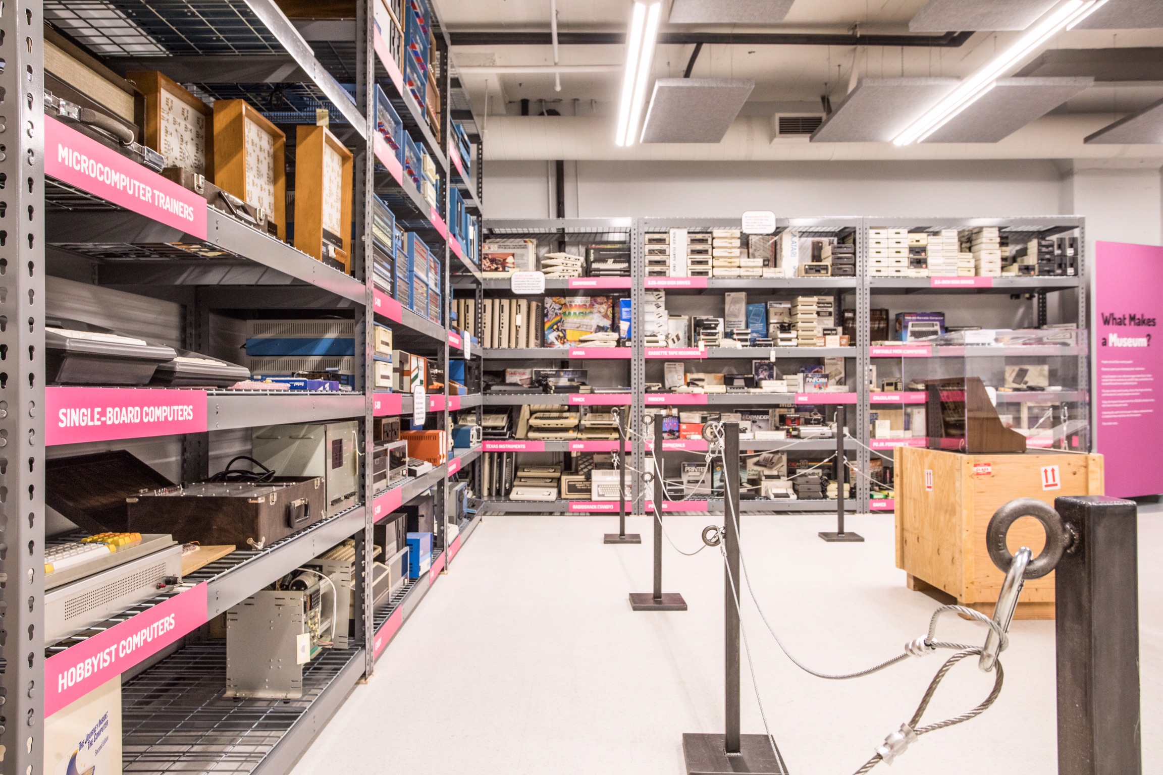
Living Computers’ curator Aaron Alcorn wanted to create a space that pushed back the veil of museums and how they work. In “What Makes a Museum,” we worked together on the creative direction of the exhibit and chose to incorporate elements from the first floor style to develop more cohesion between the exhibit floors. Aaron wrote all the content for the exhibit, while I designed all of the graphics - the largest of which included a 3D representation of how an object joins the museum collection. As a part of this exhibit, we also had to create a kiosk video, and I collaborated with the museum’s media archivist, Dorian Bowen, and the team at UW Video to build the final product.
Totally 80S REWIND
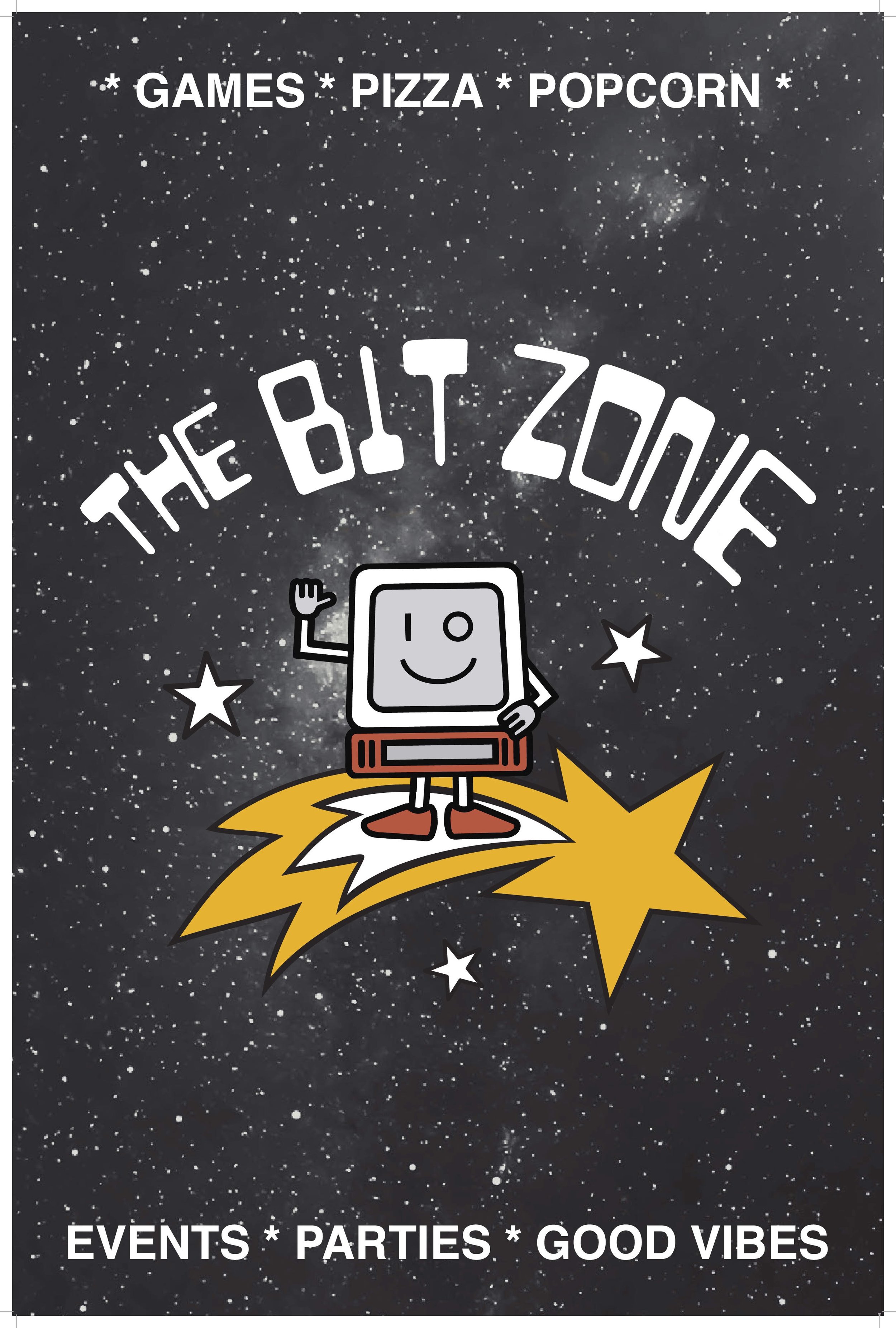
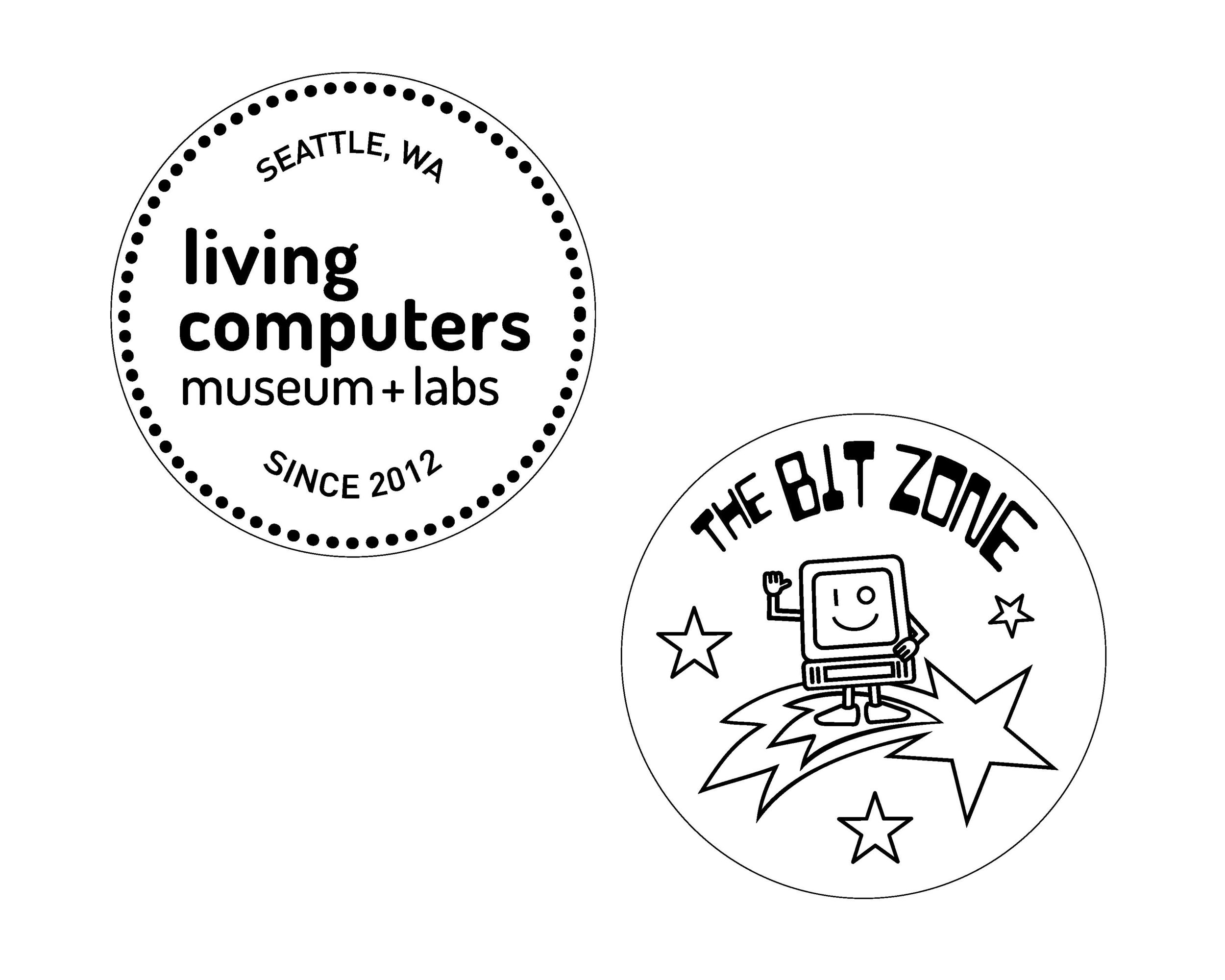
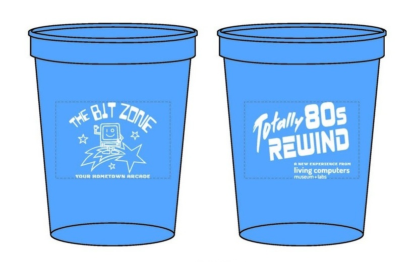
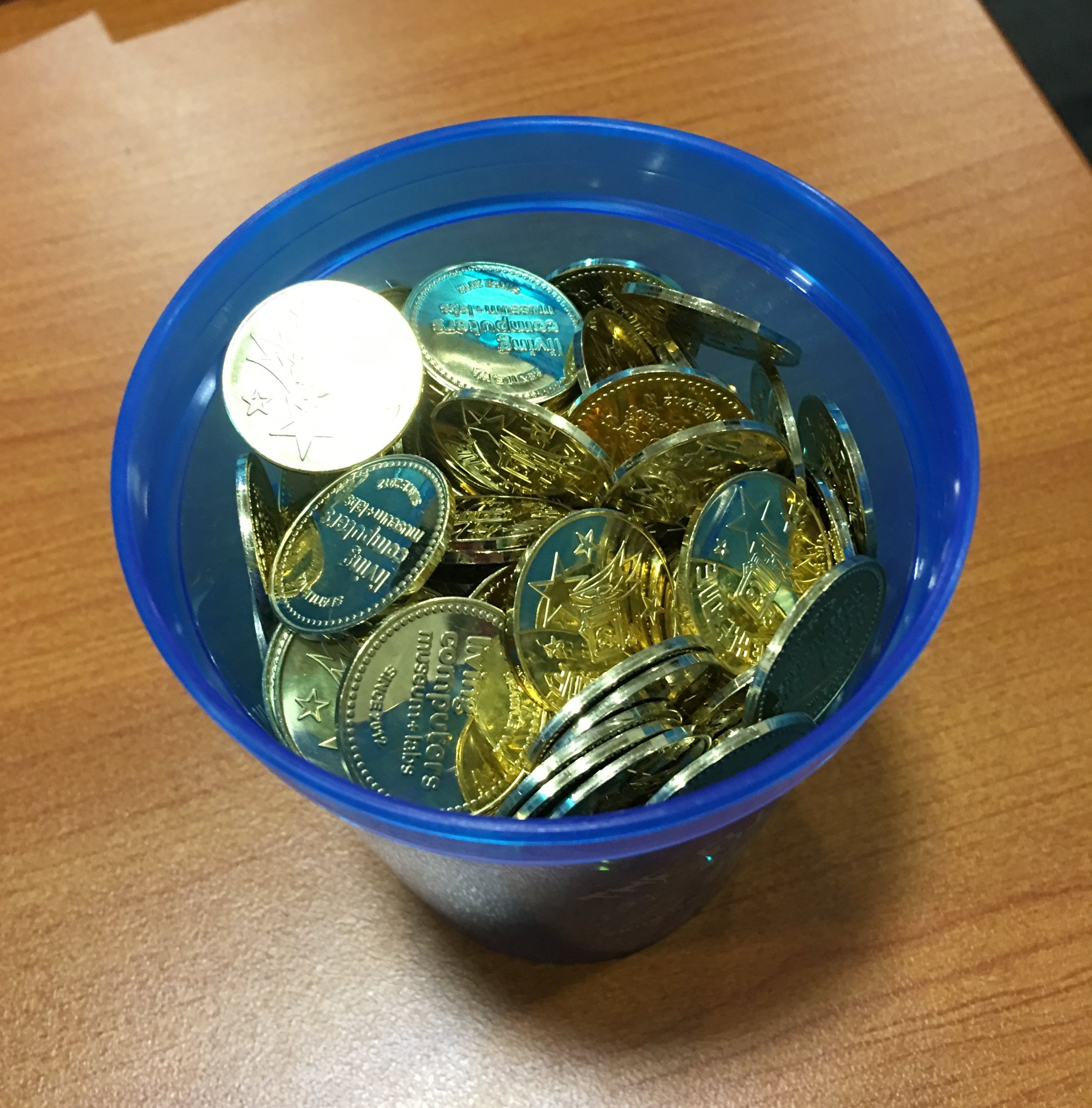
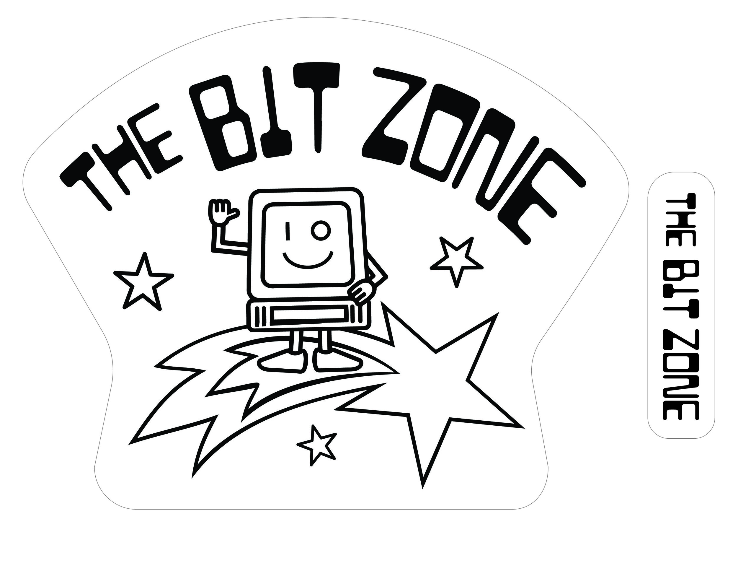
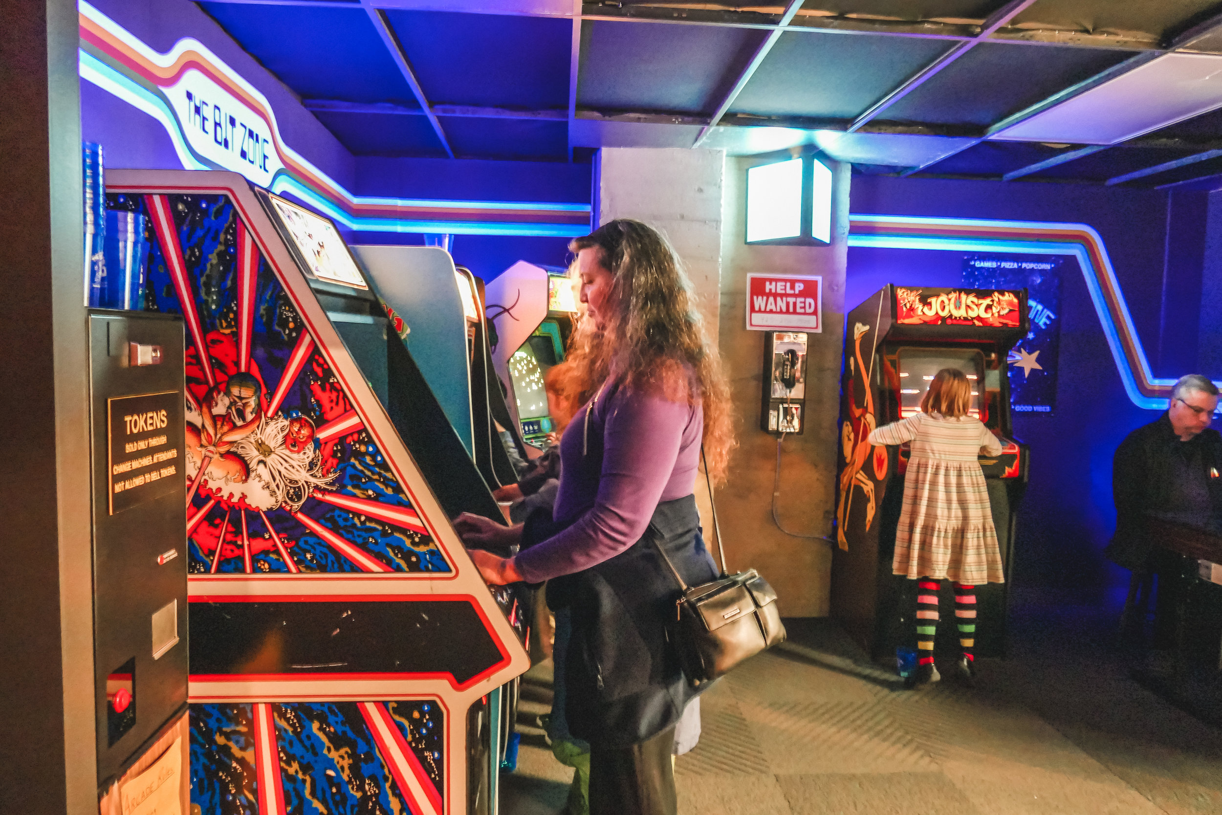
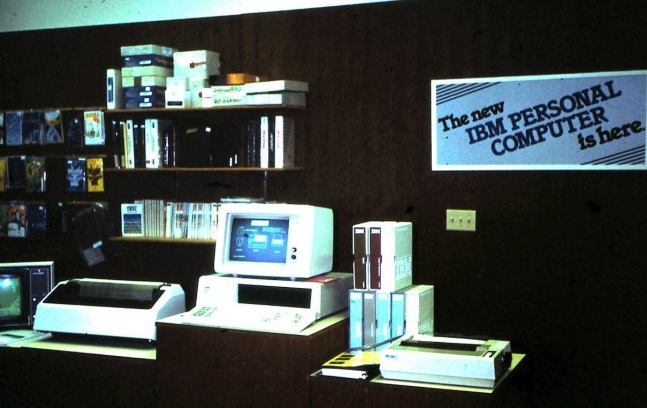
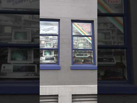
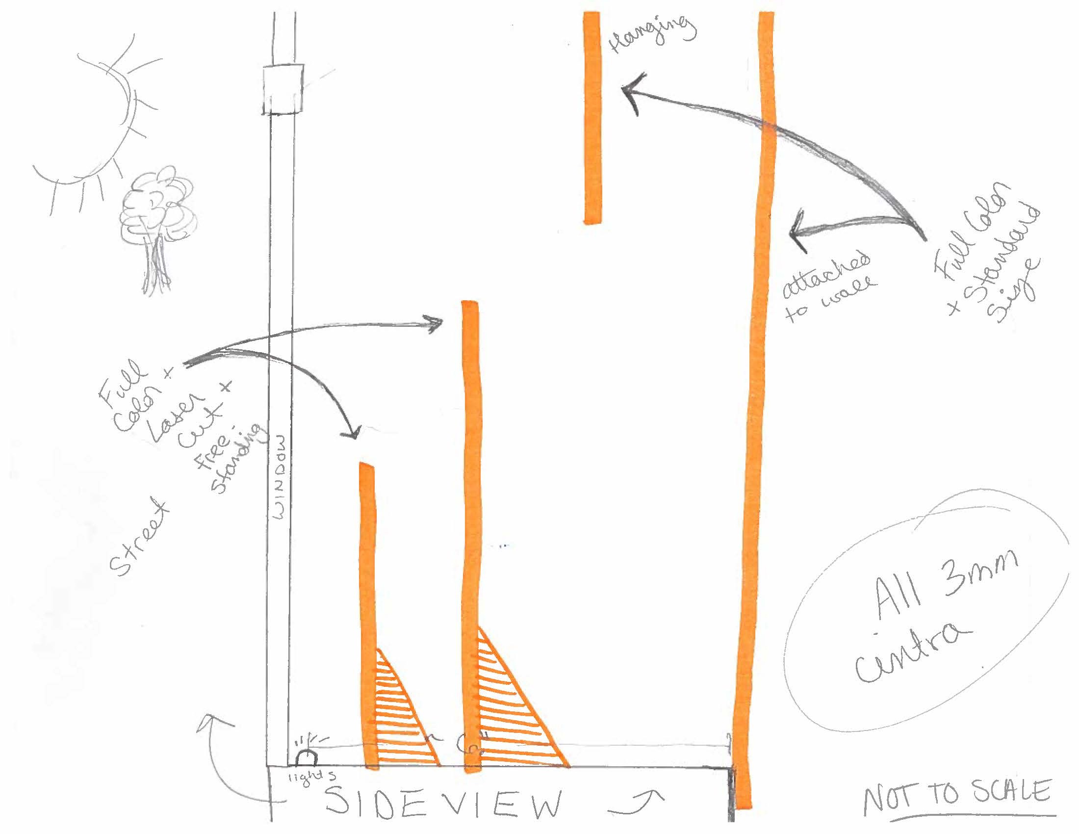
Working under the guidance of Living Computer’s curator Aaron Alcorn, I designed two portions of the Totally 80s Rewind exhibit: the branding for the fictional arcade “the Bit Zone,” and a window display to fill an area that would be covered by the upcoming exhibit. For “The Bit Zone,” this meant decorative lines along the walls, a quirky poster advertising the arcade, arcade tokens, plastic token cups, and iron-on t-shirt graphics. For the window display, I developed a 3D display of computers and gaming consoles - with the same stripe and era-appropriate typography as inside the arcade. Both displays ended up creating a deep sense of realism, and we’ve received many compliments from computer and arcade fans alike.
WHAT IS A COMPUTER?
In mid-2017, Living Computers’ curator and executive director wanted to freshen up the entrance to the second floor of the museum. Looking for bold images and colors, we worked together to make edits to the existing exhibit style and created a new object type: the bio panel. Incorporating two 10’ x 10’ spaces, I designed 3 backdrop panels, two bio panels, multiple exhibit labels, and one introduction stanchion. All of these designs were reviewed by both the curator and the executive director in a very free, critique style format - and we were all extremely pleased with the final results of the exhibit.
MAKE IT WORK
Working with the curator and his intern, I provided graphic design for the preview gallery exhibit, “Make It Work.” The two largest and most complex design pieces included an infographic and document collage, but a video slideshow with custom biography pages of each engineer was also required. The entire exhibit was designed within the museum’s branding standards for the first floor, utilizing the burnt orange color for this specific project.
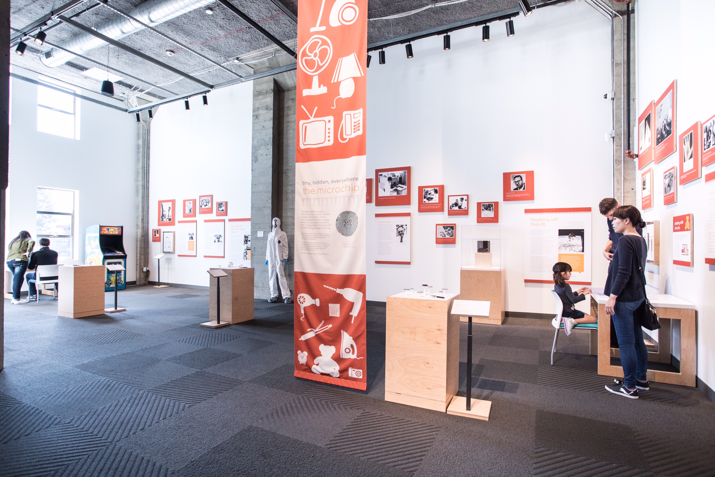
TINY, HIDDEN, EVERYWHERE: THE MICROCHIP
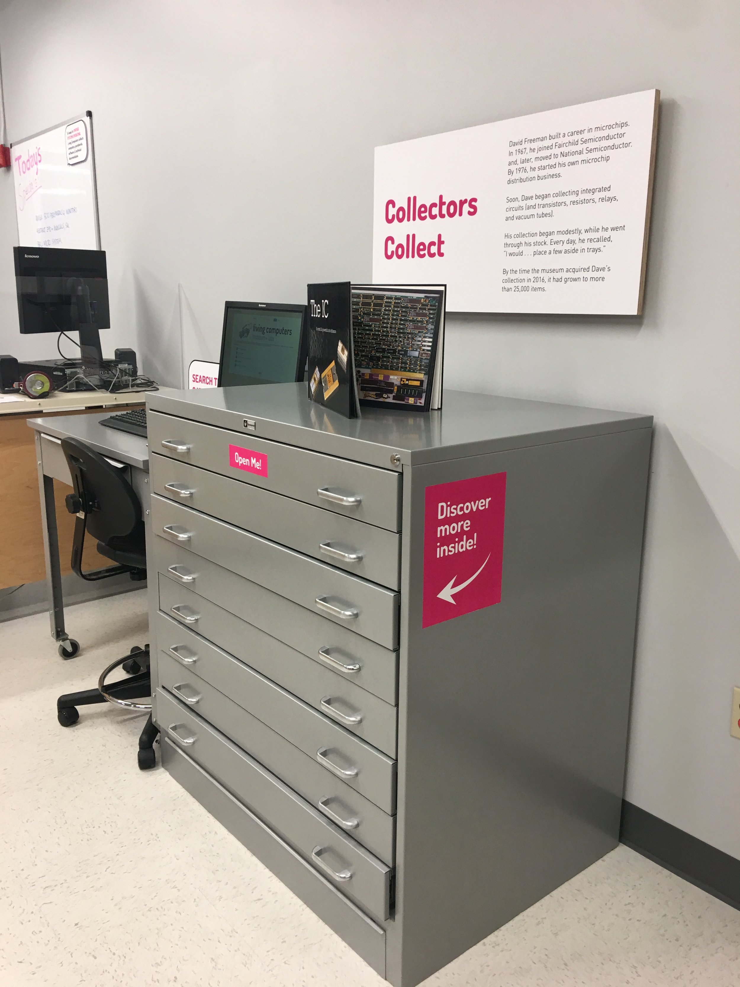
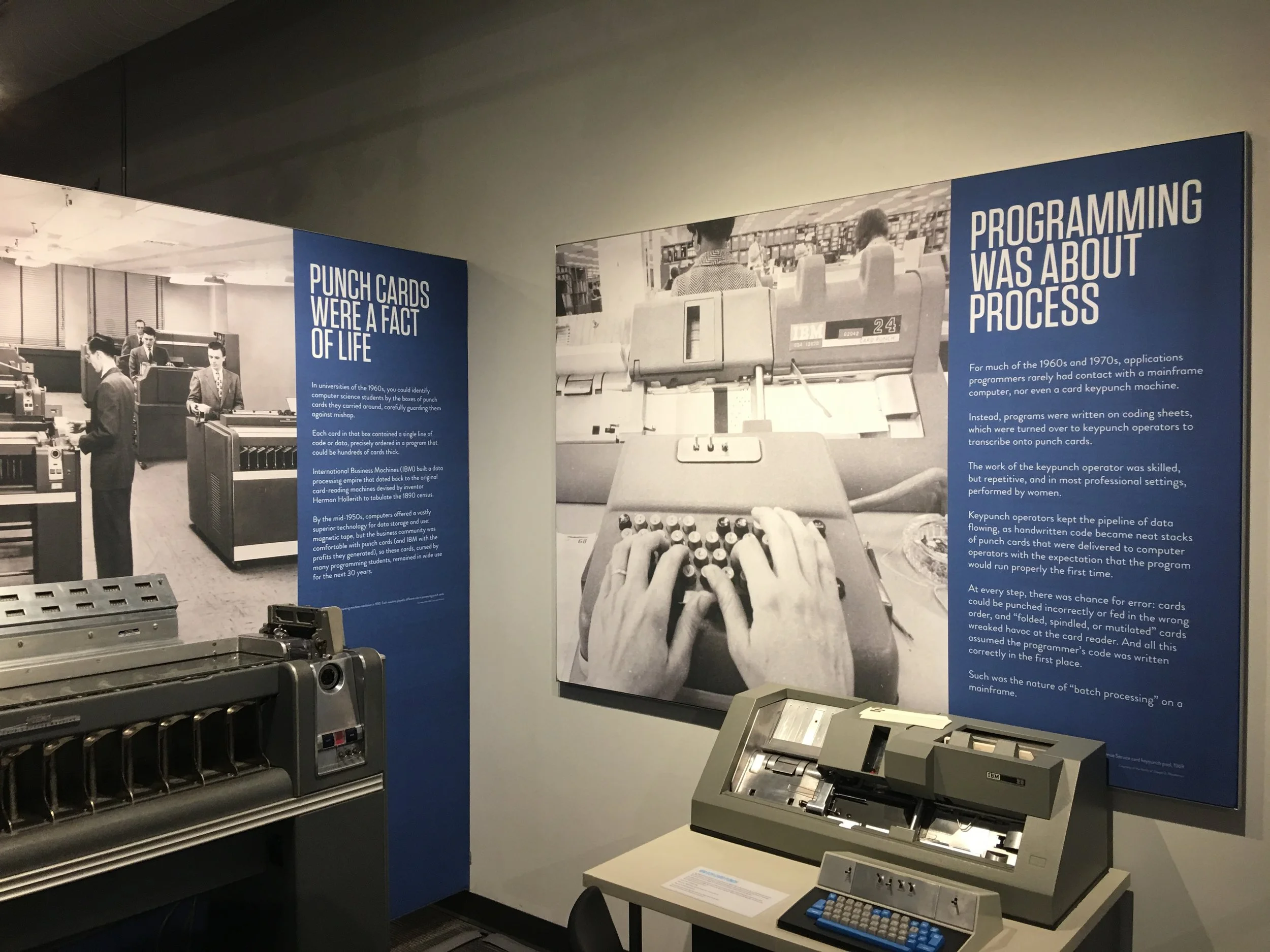
Working with the curator and his graduate intern, I provided graphic design for the special exhibition, “Tiny, Hidden, Everywhere: The Microchip.” Originally working with another exhibits and graphics designer, the curatorial team had to find someone else to cover at the last minute due to illness. I jumped into the project just after the exhibit style was developed and the overall layout of the exhibit had been determined. I powered through designing dozens of image and label panels as well as over 8+ main content panels in just under a week. We worked together to print and install all the graphics in-house, and the exhibit opened without a hitch.


